First impressions matter and the first impression your website makes is no exception.
Did you know that 89% of potential customers are likely to choose to do business with a competitor after having a poor user experience on your website?
That's why it's imperative for your website visitors to easily find what they're looking for on your website.
And since your homepage likely gets the most visits, you get your biggest return on the time invested by perfecting it first.
Don't know where to start? Don't worry; keep reading below where we break down 8 key elements every homepage needs to be successful.
8 Key Elements Your Website Homepage Needs
Be sure to include these components on your homepage so that your users don't get confused and leave without engaging. Here are 8 essential elements you must have.
1. Straight forward navigation
Since your homepage is just the starting point for your visitor's journey on your website, it is essential that your navigation is as straightforward as possible. You want to make sure that the links you include in your navigation will be pages that your visitors are interested in viewing.
If your menu doesn't make sense, users will not spend time finding what they're looking for. They will just leave and possibly even go to a competitor's website. Your menu should be visible on all of your website pages (with the exception of landing pages) and should be easy to read and use.
For example, you can include your main pages such as Services, About Us, and Projects in your navigation. If you want to create a page for each of your services, then you can create a submenu under your Services menu item to help your navigation from being too cluttered. This also helps your user find what they're looking for even faster!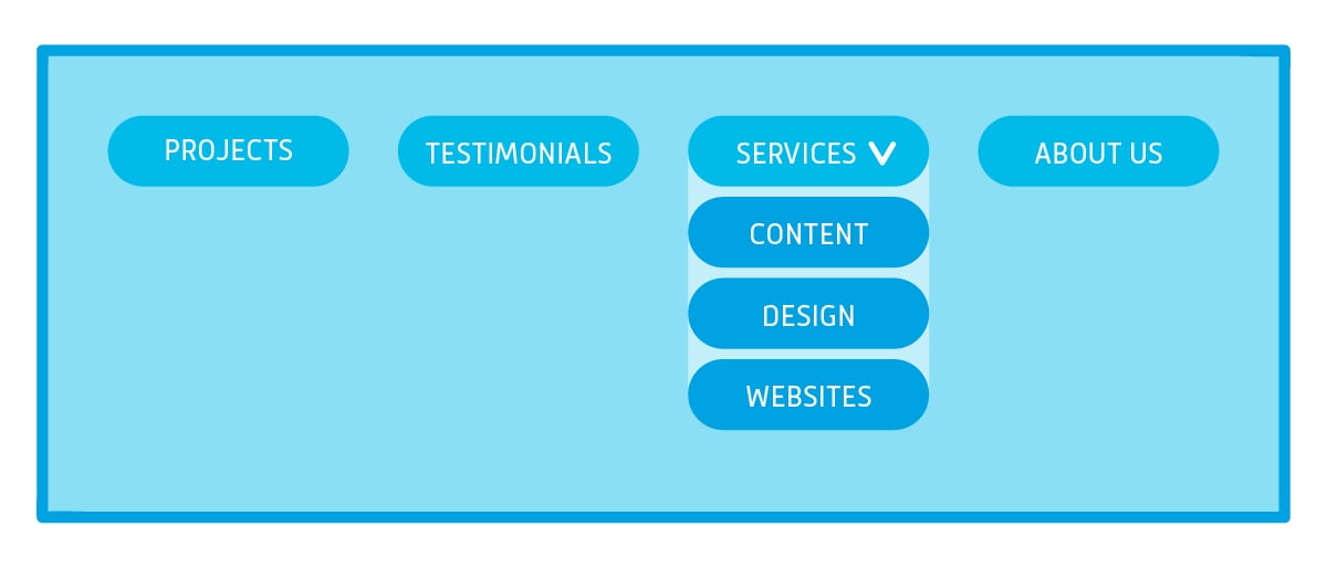
2. Concise Headline
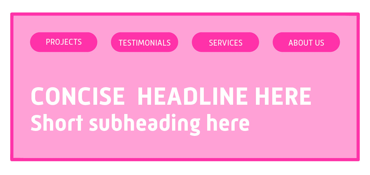
Your headline is the first thing your visitors will see when they arrive on your homepage. Therefore, it should be concise, noticeable, and engaging. This is an opportunity to convey what your organization does or even better, why you do what you do.
Underneath your headline, you should have a subheading that is no more than a couple of sentences that provides more information about what your organization does. Your headings should appeal to your target audiences' needs and should be easy to skim.
3. Logo
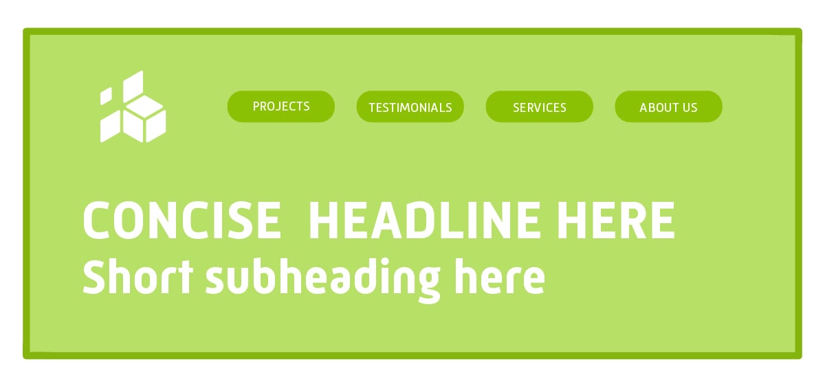
Your organization's logo needs to be at the top of your website on every page. It should be readable and link back to your homepage. Your logo will help your users associate your content with your brand.
4. Clear Call to Actions
Yes, your homepage is an important part of your website, but the ultimate goal is for users to click onto your other pages, initiate contact with your organization, or convert into a customer. Call-to-action (CTA) buttons can help guide your website visitors to a specific page so they can take the next step.
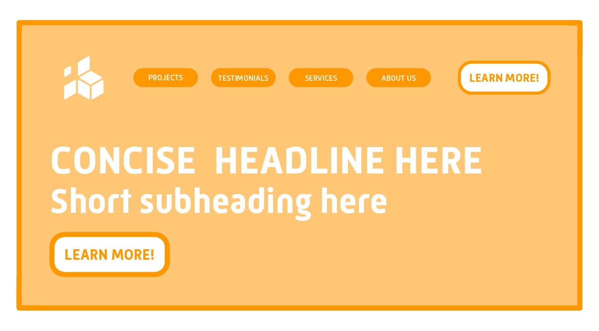
On your homepage, you should have a CTA on your navigation. Most commonly, these CTA buttons are contact buttons. Underneath your headline and subheading, you should have a CTA button that leads to a page on your website that has more information about your products/services.
Each section that you have on your homepage should have a relevant call-to-action so that your website visitors can continue their experience on your website seamlessly.

5. Pop-Up
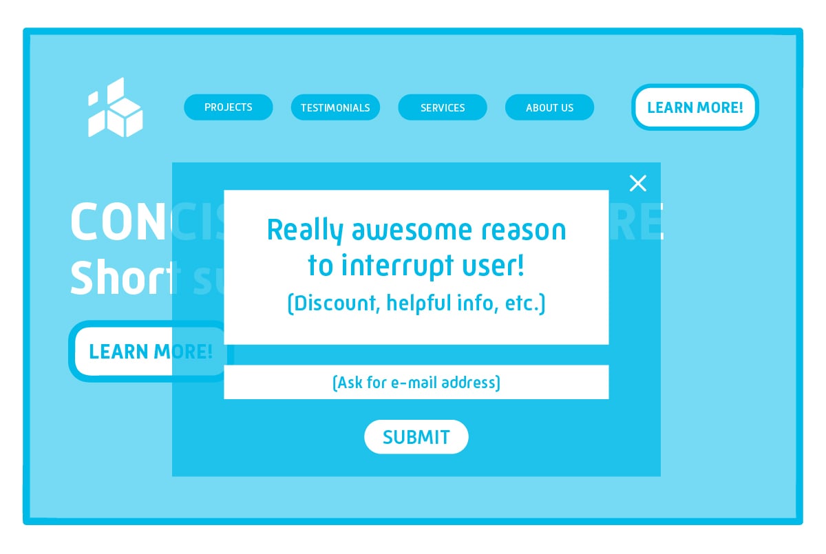
One thing you want to avoid doing on your homepage is overloading it with content to the point where your users feel overwhelmed. However, you may have a special promotion or offer that you really want to make sure all of your website visitors see. This is where pop-ups come in to make sure your offer is visible.
On e-commerce sites, you will likely see pop-ups immediately upon entering the site that offers a discount in exchange for a newsletter sign-up. Other types of websites use pop-ups to inform the user about special content and request the user's email address to receive that content. Not only do pop-ups help you give your users something useful, but they also help you generate more leads.
The key to making a pop-up successful and not annoying to your website visitor is to offer them something that they would genuinely be interested in signing up for. Be sure to disable the pop-up after they have completed the desired action.
6. Relevant Images
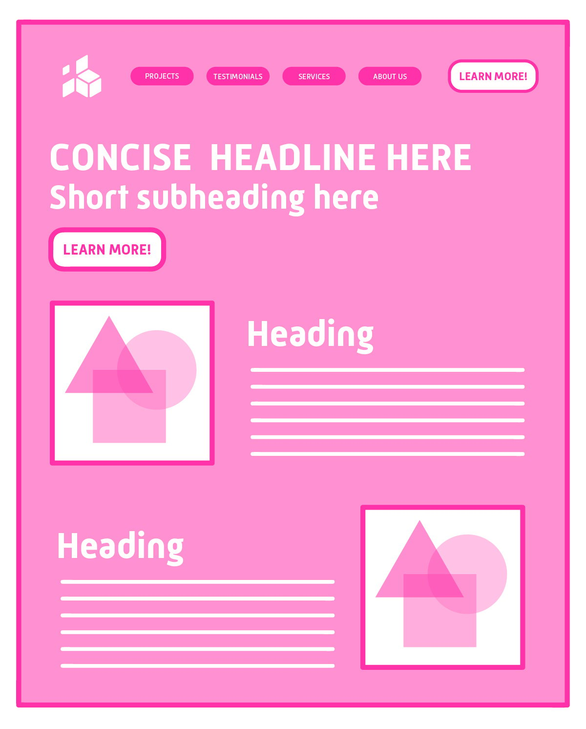
No one wants to read blocks of text on your homepage. Be sure to accompany small blurbs on your homepage with relevant, on-brand images to help make the text easier to read. Make sure your images are consistent. For example, you can use stock photos that feature real people or you can stick to animations, but don't mix the two.
7. Social Proof
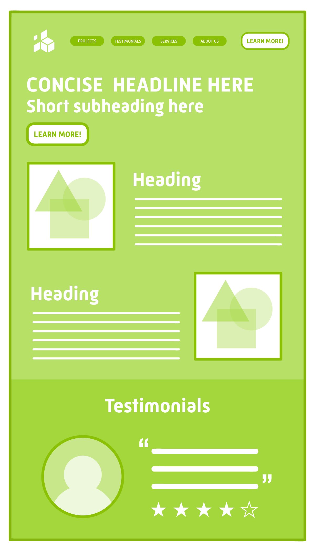
You can write the best copy in the world about your company, but that won't be all you need to help convert your users. Did you know that 92% of consumers are more likely to trust non-paid recommendations than any other type of advertising? Testimonials about your product/service provide a sense of loyalty and trust that no other type of content can do.
That being said, it is essential to show off some form of social proof on your homepage so that you can establish credibility with your website visitors.
8. Chatbot
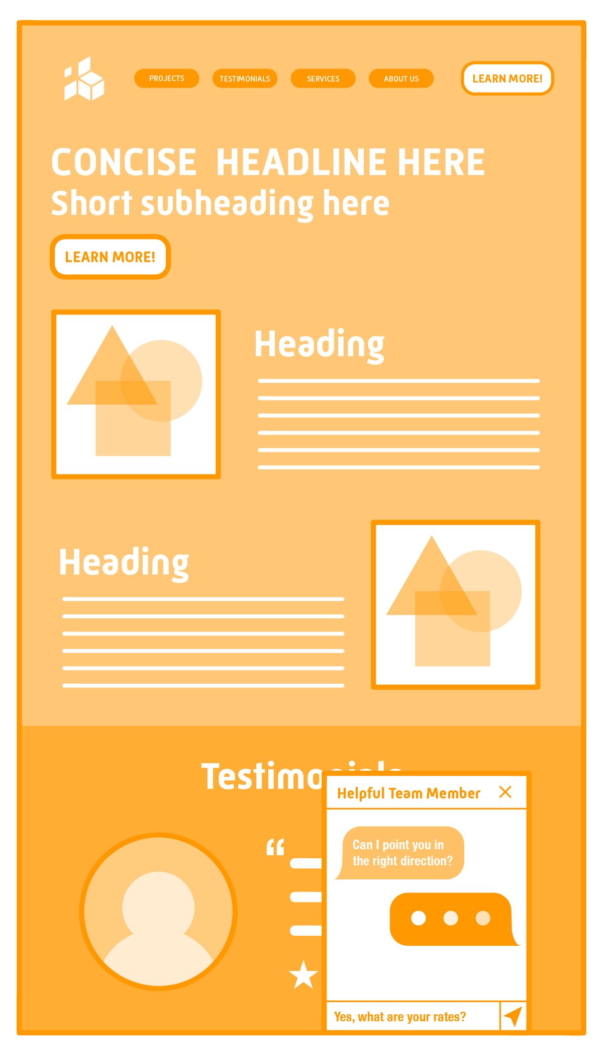
Before the chatbot trend, you could argue that one of the benefits of doing business in person was that you got to talk to a real person about your specific questions. Now that experience is easy to achieve directly on your website with chatbots!
You can have your chatbot respond to frequently asked questions and then ask for the user's contact info so that a representative can follow up in more detail later. Or you can hire a customer service rep that responds to your website visitors while they are on the site. Either way, chatbots can help improve your website visitors' customer service experience and will overall help increase user engagement.
These are 8 key elements that every homepage should have in order to provide the best user experience. There are a lot of different ways you can make your homepage unique, but at the end of the day, it should be easy to find your content and take the next step.
Tired of wasting time on low-quality leads that don't convert? Learn about how our unique Conquer MethodTM can take your business to the next level by clicking the button below.


